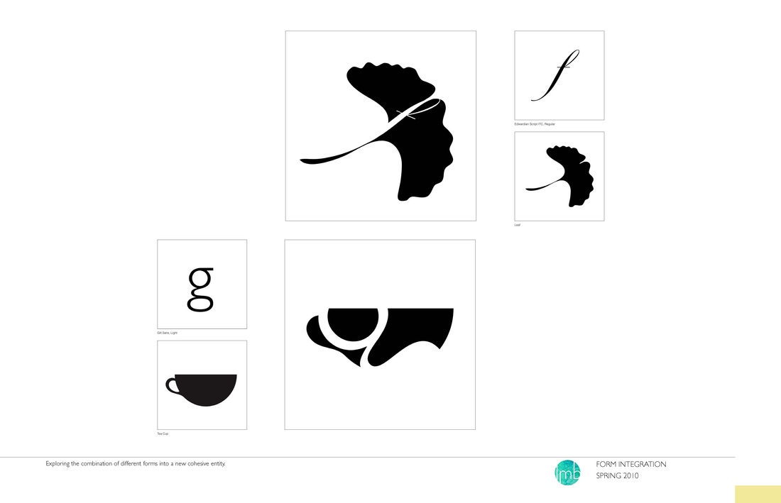
Exploring the combination of different forms to create a new cohesive entity.
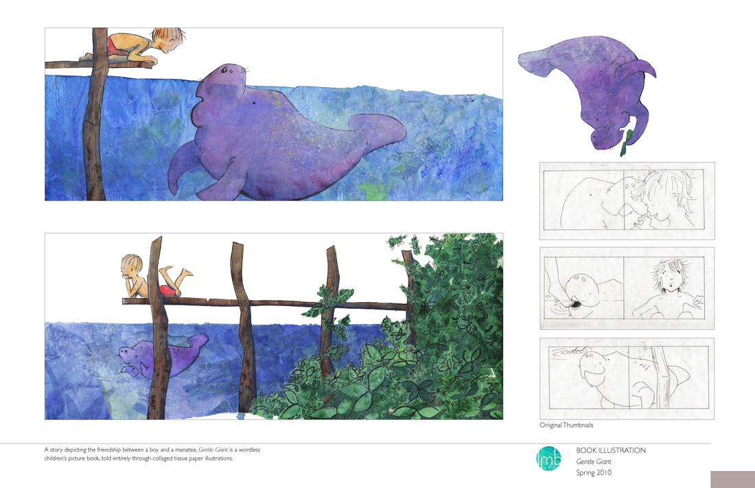
A story depicting the friendship between a boy and a manatee, Gentle Giant is a wordless children’s picture book, told entirely through collaged tissue paper illustrations.
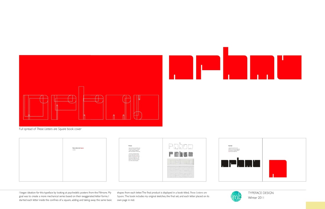
I began ideation for this typeface by looking at psychedelic posters from the Fillmore. My goal was to create a more mechanical series based on their exaggerated letter forms. I started each letter inside the confines of a square, adding and taking away the same basic shapes from each letter. The final product is displayed in a book titled, These Letters are Square. The book includes my original sketches, the final set, and each letter placed on its own page in red.
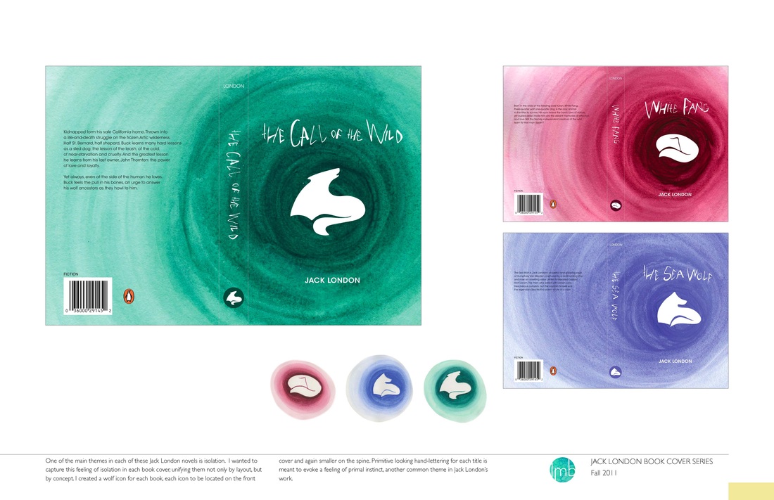
One of the main themes in each of these Jack London novels is isolation. I wanted to capture this feeling of isolation in each book cover, unifying them not only by layout, but by concept. I created a wolf icon for each book, each icon to be located on the front cover and again smaller on the spine. Primitive looking hand-lettering for each title is meant to evoke a feeling of primal instinct, another common theme in Jack London’s work.
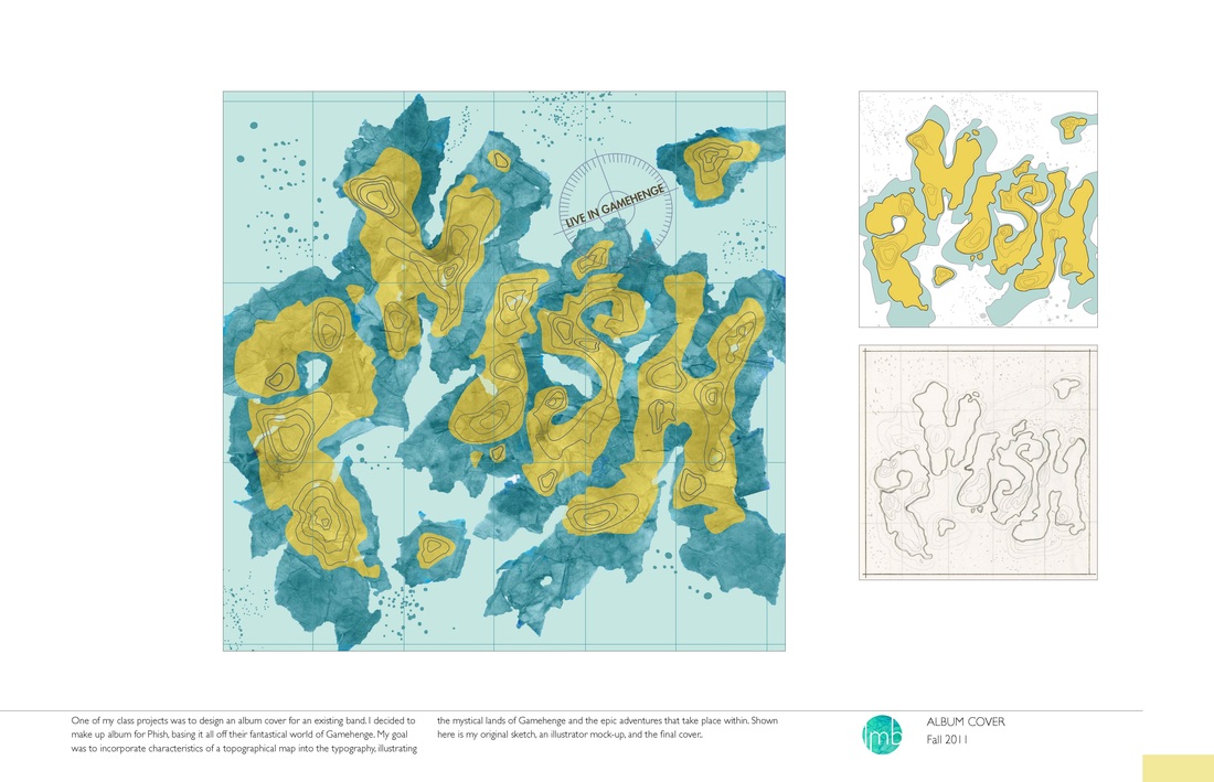
One of my class projects was to design an album cover for an existing band. I decided to make up album for Phish, basing it all off their fantastical world of Gamehenge. My goal was to incorporate characteristics of a topographical map into the typography, illustrating the mystical lands of Gamehenge and the epic adventures that take place within. Shown here is my original sketch, an illustrator mock-up, and the final cover..
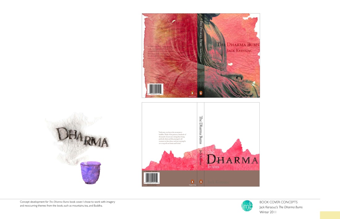
Concept development for The Dharma Bums book cover. I chose to work with imagery and reoccurring themes from the book, such as mountains, tea, and Buddha.
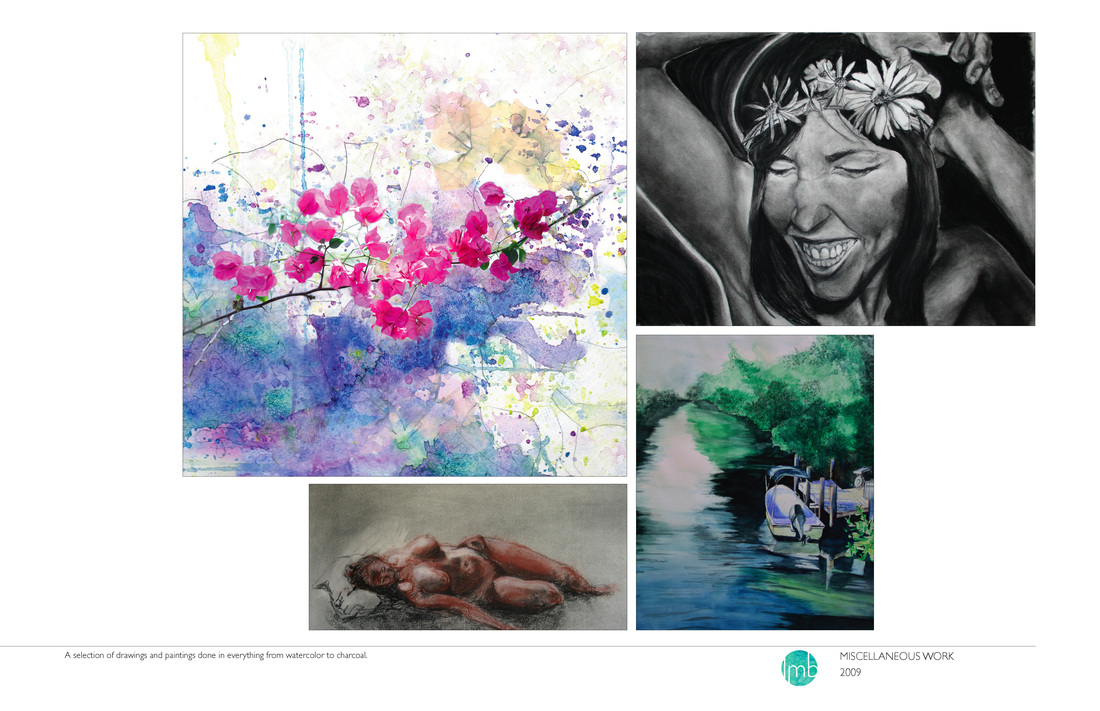
A selection of drawings and paintings done in everything from watercolor to charcoal.